Riyadh · Khobar  /  Sun–Thu 9:00–18:00
+966 55 121 1391 contact@seostuffing.com
SEO Stuffing
Services Industries Cities Blog About Contact
عربي Free consultation
Home/Blog/Local SEO
Website design · 8 min read

What Is UX/UI Design? A Simple Explanation

A simple explanation of UX and UI design, what the terms mean, how they differ, and why they matter for your Saudi business website.

SEO Stuffing editorial team
Updated July 20, 2026
What Is UX/UI Design? A Simple Explanation

UX and UI are terms you'll encounter frequently in conversations about website design, and they're often confused with each other or used interchangeably when they actually refer to different things. Understanding both helps you make better decisions about your website and communicate more clearly with designers.

What Is UX Design?

UX stands for User Experience. UX design is the practice of designing digital products, websites, apps, software, so they're easy and satisfying to use. It's concerned with the overall experience a person has when interacting with a product: Can they find what they're looking for? Does the flow of pages make logical sense? Do they accomplish their goals without frustration?

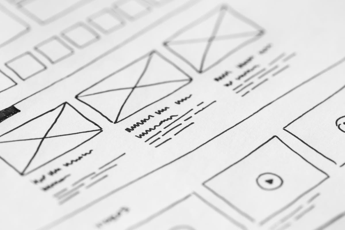
UX design involves research, testing, and iteration. A UX designer might study how users navigate a website, identify where they get confused or stuck, and redesign those sections to work better. The output of UX work is often wireframes (structural blueprints of pages) and user flows (maps of the paths users take through a website).

What Is UI Design?

UI stands for User Interface. UI design is the practice of designing the visual elements of a digital product, the colors, typography, buttons, icons, images, and layouts that users see and interact with. It's the aesthetic and visual layer that sits on top of the UX structure.

A UI designer takes a UX wireframe, which might be a simple box layout showing where elements go, and turns it into a visually appealing, brand-consistent design. UI design is closer to graphic design in its skills and outputs.

How They Work Together

The classic analogy: UX is the architecture of a building (how the rooms are arranged, where the doors and corridors go, how people flow through the space), and UI is the interior design (the colors, materials, furniture, and aesthetic that make it beautiful and pleasant to be in).

Both matter. A website with excellent UI but poor UX looks beautiful but is frustrating to use. A website with excellent UX but poor UI works logically but looks unprofessional and fails to build trust. The best websites have both, intuitive structure and attractive presentation.

UX and UI in the Saudi Context

For Saudi business websites, UX considerations include: how prominently the WhatsApp button appears and how easy it is to find, how naturally the site flows between Arabic and English versions, and whether key information (services, location, hours) is findable within two clicks from anywhere on the site.

UI considerations for Saudi businesses include: Arabic typography that reflects the brand tone, color choices that align with Saudi cultural preferences, and visual design that feels professional and trustworthy to a Saudi audience.

For more on what makes websites effective for Saudi businesses, see our main guide: What Makes a Website User-Friendly?

The Distinction That Actually Matters

User experience is the shape of the journey: what a visitor is trying to do and whether the path lets them. User interface is what that journey looks like and how it responds. A site can have a good interface and a poor experience, and frequently does.

The practical version for a small business is simpler than the terminology suggests. Decide what a visitor most commonly wants, make that the easiest thing on the page, and make it look trustworthy while doing it.

Most sites judged badly designed fail on the first part. They look competent and make the common task unnecessarily hard.

Where Small Businesses Get the Most From It

The highest-return work is almost always removing steps. Fewer form fields, fewer clicks between the homepage and a phone number, fewer decisions before the visitor gets what they came for.

The second is consistency. Buttons that look and behave the same everywhere, headings that follow one pattern, and language that uses one word for one thing all reduce the effort of reading a site.

The third is honest feedback: confirmation that a form was sent, visible states on buttons, and error messages that say what went wrong. Silence after an action is the most common cause of a visitor giving up.

UX in a Bilingual Context

Right-to-left is a user experience decision before it is a visual one. Reading order, form flow, icon direction and navigation position all change, and a mirrored design produces a journey that feels subtly wrong.

Language switching should preserve context. Sending someone to the homepage when they switch is a small failure that reliably costs enquiries.

Content itself needs writing in each language rather than translating. A translated page is a usability problem as much as a marketing one, because it makes the reader work to understand what should have been plain.

Testing Without a Budget

Three people unfamiliar with the business, asked to complete one task while you watch silently, will find most of what is wrong. This costs nothing and outperforms most formal processes at small scale.

Watch where they hesitate rather than listening to what they say afterwards. People rationalise their difficulties and rarely report the moment they were confused.

Fix the largest hesitation, then test again. Iterating on real observations beats redesigning against opinions, including your own.

Visual Choices That Carry Weight

Contrast, spacing and type size do most of the work in whether a page feels comfortable. Text too small or too pale to read easily is the most frequent visual failure, and it is entirely avoidable.

One accent colour used consistently for actions teaches visitors what is clickable without anyone explaining it. Sites using colour decoratively lose that signal and have to compensate with labels.

Spacing communicates grouping. Related things placed close together and unrelated things separated is understood instantly, and it does more for comprehension than any amount of styling.

Where Design Meets Trust

A site that looks maintained is trusted more than one that looks abandoned, regardless of the quality of the business behind it. Current photographs, correct dates and working links all contribute.

For Saudi customers, local proof carries particular weight: a real address, an Arabic contact option, named districts, recognisable work. These answer the unspoken question of whether the business is genuinely nearby.

Stock photography of people who are obviously not your team works against all of this. It is recognisable and it undermines exactly the credibility the design was meant to establish.

Accessibility Is Just Good Design

Accessibility tends to be filed as a separate specialist concern, which is unfortunate, because the changes it asks for improve the experience for everyone using a phone in bright sunlight or in a hurry. The overlap is nearly total, and treating it as ordinary quality rather than as compliance is what gets it done.

Four things carry most of the benefit. Sufficient contrast between text and background, which also determines whether anyone can read your site outdoors at midday. Text large enough to read without zooming, which on a phone means around sixteen pixels for body copy. Tap targets big enough to hit accurately, roughly the size of a fingertip, with enough space between them that a mis-tap does not call the wrong number. And form fields with visible labels rather than placeholder text that vanishes as soon as someone starts typing.

Two more matter for Arabic sites specifically. Line height needs to be looser than a Latin-only design would use, because diacritics and descenders are clipped by tight leading and the text becomes tiring to read. And directional elements, including icons that indicate forward motion, need to mirror properly in right-to-left layouts, since an arrow pointing the wrong way is a small thing that quietly tells a reader the site was not built for them. None of this requires a specialist audit to begin. Testing your own site on a phone, outdoors, one-handed, finds most of it.

Frequently asked questions

What is the difference between UX and UI?+
UX is the shape of the journey: whether a visitor can do what they came to do. UI is what it looks like and how it responds. Sites often have a good interface and a poor experience.
What gives a small business the most benefit?+
Removing steps. Fewer form fields, fewer clicks to contact, fewer decisions before the visitor gets what they came for.
Why does consistency matter?+
Buttons, headings and wording that behave the same everywhere reduce the effort of reading a site. Inconsistency makes people re-learn the page repeatedly.
What is the most common cause of visitors giving up?+
Silence after an action. No confirmation that a form sent, no visible button state, no clear error message.
Is right-to-left a design or UX issue?+
Both, but UX first. Reading order, form flow and navigation position all change, and a mirrored layout feels subtly wrong to Arabic readers.
How do I test my site without a budget?+
Ask three unfamiliar people to complete one task while you watch silently. Note where they hesitate rather than what they say afterwards.
Do I need a UX specialist?+
Rarely at small scale. Most available improvement comes from removing steps and testing with three real people.
Does good design mean minimal design?+
Not necessarily. It means the common task is the easiest thing to do. Minimal sites that hide contact details are badly designed too.
What visual choices matter most?+
Contrast, spacing and type size. Text too small or pale to read comfortably is the most common visual failure and the easiest to fix.
How does design affect trust?+
A site that looks maintained is trusted more than one that looks abandoned. Current photographs, correct dates and working links all contribute.
Keep reading

Related guides

All 73 posts →
How Local SEO Works for Small Businesses in Saudi Arabia
Local SEO · 9 min
How Local SEO Works for Small Businesses in Saudi Arabia
What is Google Business Profile and How Does It Work
Local SEO · 8 min
What is Google Business Profile and How Does It Work
How Google Ads Works for Beginners
Google Ads · 8 min
How Google Ads Works for Beginners
Closing plate

Want us to do this for you?

A free audit, a straight answer, and no obligation to work with us afterwards.

Get a free audit WhatsApp us
SEO Stuffing

Bilingual SEO and paid media for Saudi businesses. Riyadh and Khobar.

PRINCE MUHAMMAD IBN ABD AL AZIZ RD
AL MALAZ, RIYADH 12836
+966 55 121 1391
CONTACT@SEOSTUFFING.COM
Services
Cities
Company
© 2026 SEO Stuffing · Fast Digital Services
Riyadh · Khobar · Saudi Arabia